Understanding the Heat Map
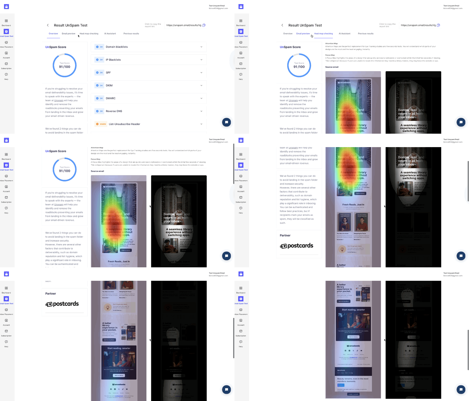
An AI heat map predicts where your subscribers’ eyes will naturally focus within your email. The AI analyzes your email's design and layout to show you where attention is naturally drawn.
The Attention Heat Map uses three colors to show where attention is drawn:
- Red: Areas that get the most attention
- Yellow: Areas with moderate attention
- Green: Areas that receive the least attention
This gives invaluable insight into your email's visual hierarchy. This way, you'll know where to put the most important content in the right spot, like your main call-to-action button.
The Focus Map highlights exactly which sections of your email are likely to be seen. Visible areas appear clearly, while black areas indicate parts of your email that people probably won’t see or will ignore.
Step-by-Step Guide
- Log in to your Unspam.email account.
- Run an Email Spam Test, and open the report.
- Navigate to the Heat map checking tab.
- Review the Attention Heat Map colors:
- Red: Most attention
- Yellow: Moderate attention
- Green: Least attention
- Check the Focus Map to see which areas of your email are clearly visible (shown) and which are likely missed (black).
- Optimize your email layout by moving important elements from green or black areas into red or visible zones to boost engagement.
